Prague City is Refreshing Its Look - and It's All About Bold New Design
Prague Morning
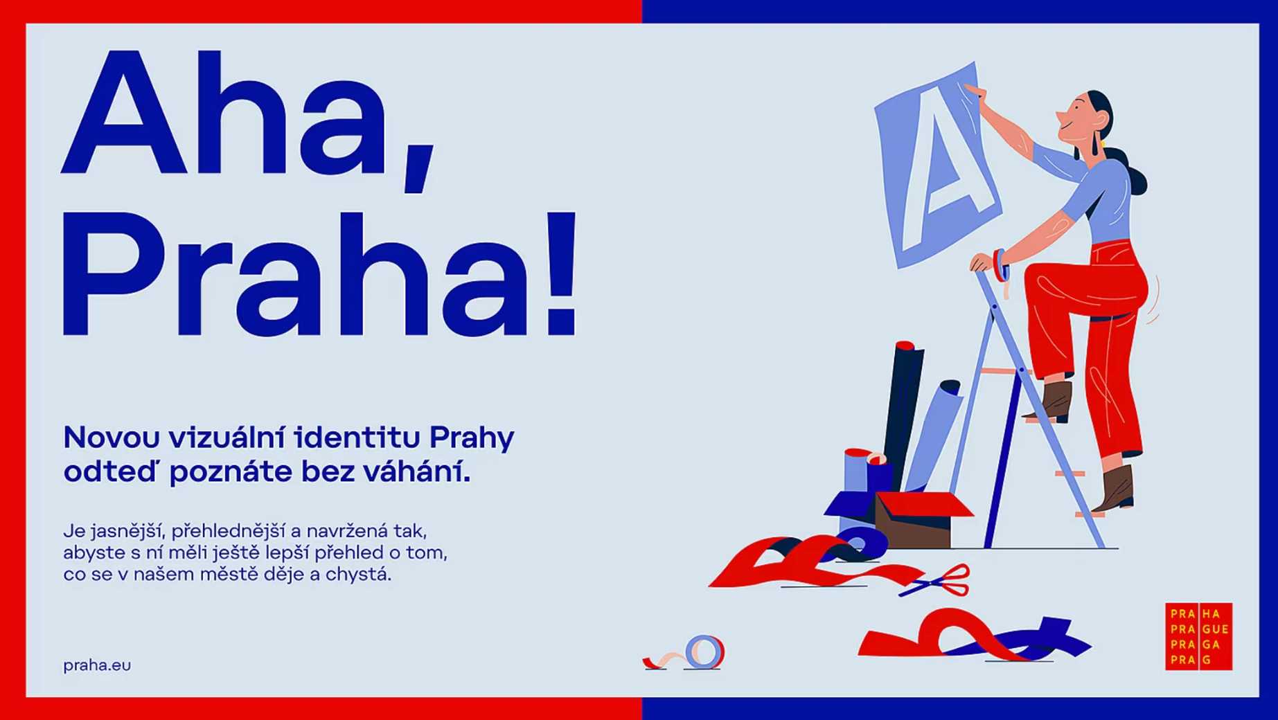
After more than two decades, Prague’s iconic graphics are getting a fresh update filled with creativity and modern flair.
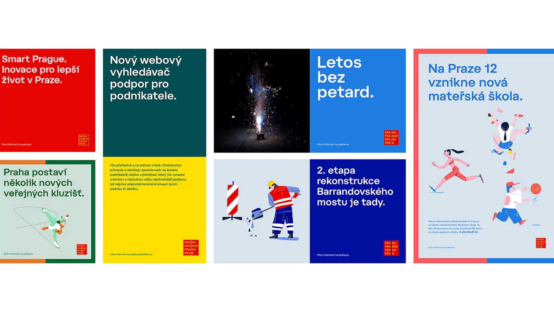
The capital is introducing playful illustrations, new pictograms, and even a custom font by renowned Czech designer Tomáš Brousil. And for special occasions? Festive gold is making its debut in the colour palette.
Honouring Tradition While Embracing Change
Prague’s distinctive logo, designed by Studio Najbrt in 2002, isn’t going anywhere. Instead, the city is enhancing and expanding its visual identity. “We live in a time of rapid change, and we need to adapt,” said Prague’s mayor, Bohuslav Svoboda. “This new design will significantly improve how the city communicates with its people.”
Up until now, Prague relied on the Myriad Pro font – but that’s changing. The new typeface, described by city hall spokesman Vít Hofman as “a modern geometric grotesque with wider proportions and unique details,” adds a contemporary and striking edge to the city’s visual language.
Subtle Tweaks, Bold Results
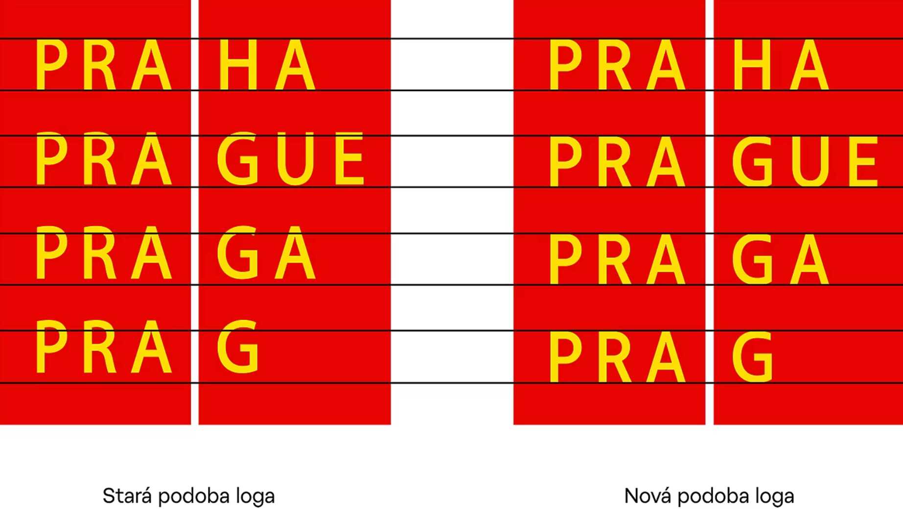
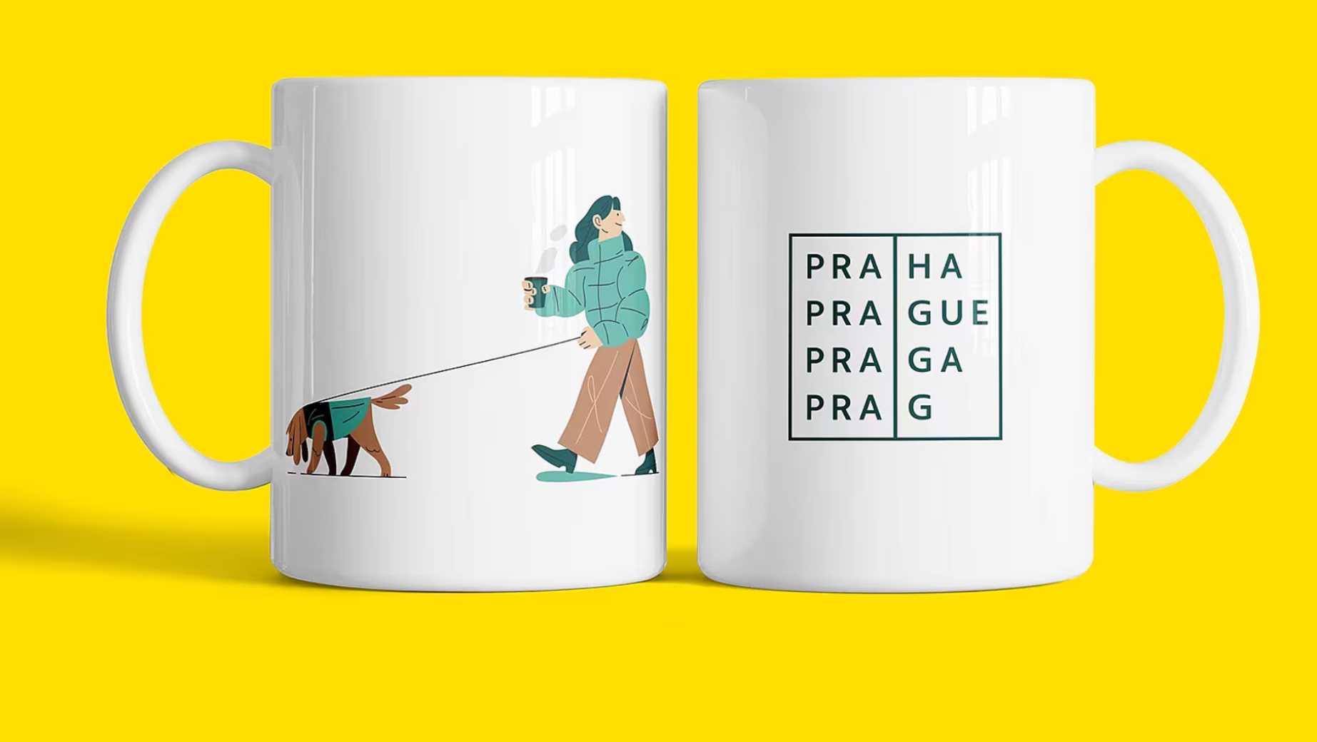
The refresh goes beyond just fonts. A square motif has replaced the traditional round dot, bringing a cleaner, sharper look to the design. One subtle yet impactful change is the straightening of the leg in the letter R, refining the overall aesthetic.
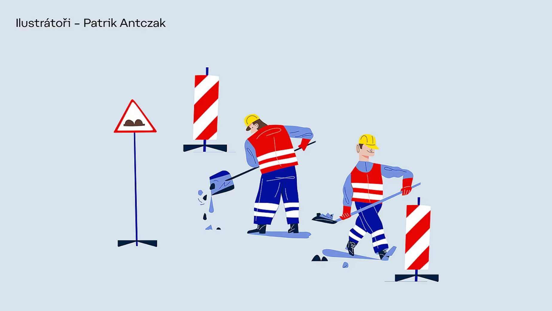
One of the most exciting updates is the introduction of playful illustrations. Created by artists Patrik Antczak and Jakub Mikuláštík, these drawings showcase Prague residents, city landmarks, and local culture in a charming, imaginative way. For the first time, pictograms will also be part of the city’s visual identity – adding clarity and consistency across public materials.
A Splash of Colour – and a Hint of Gold
Colour plays a vital role in this update. While blue and green remain key shades, the city’s palette is expanding to include more vibrant combinations – with gold reserved for festive and special occasions. From official documents to public posters and digital platforms, this enhanced palette will brighten Prague’s visual presence.
“The red cube logo has stood the test of time,” said Jana Berková from Prague City Hall. “But after twenty years, we needed clearer rules and expanded options to fit today’s design needs. This refresh strengthens our identity, making it more unified and recognizable.”
Continuity with a Creative Twist
Rather than starting from scratch, Prague worked closely with the original creators at Studio Najbrt to evolve the existing design. This thoughtful approach was praised by Jana Vinšová, director of Czechdesign: “You don’t always need to reinvent everything. Sometimes, fresh energy and careful updates can revitalize a visual identity.”
The new design will be introduced gradually. Existing materials with the previous graphics will be used until supplies are depleted, after which the refreshed design will take over. The project’s cost is approximately CZK 1 million (excluding VAT).
Aleš Najbrt, graphic designer and creative director of Studio Najbrt, expressed his enthusiasm for the project: “This marks the next chapter in Prague’s visual story. We’re proud to continue shaping the city’s evolving identity.”
Would you like us to write about your business? Find out more
-
NEWSLETTER
Subscribe for our daily news


